
GSOC Sugar Labs - Week 14
This is the fourteenth post in the series of my weekly GSOC Sugar Labs, where I summarize my week of working with Sugar Labs under GSOC.
Weekly Journal
This week Samuel and I worked on the frontend and tried to achieve a pleasant UI with a good UX(at least that’s what we think ![]() )
Also Samuel fixed the i18n by adding support for variants of english (en-IN,en-GB) and refactoring the whole i18n branch.
)
Also Samuel fixed the i18n by adding support for variants of english (en-IN,en-GB) and refactoring the whole i18n branch.
Refactoring and fixing the i18n support
Samuel did all of the work of refactoring and fixing up my mistakes on the i18n branch.
Which included moving the logic outside the wsgi.py and moving pagination away from the views and fixing . The way i18n is setup we handle each locale differently, unless it’s en (English), then we re-direct all variants of it (en-IN Indian English, for instance to ) English en). However we treat en-US and en-GB differently, since they do all have translations in po files, although majority of them are in en-US.
This is how redirection is done.
def set_lang_redirect(app):
     def get_language():
         # Detect lang based on Accept-Language header
         langs = request.accept_languages
         if not langs:
             return 'en'
         langs = [lang.replace('-', '_') for lang in langs.values()]
         lang = langs[0]
         # treat 'en_*' languages as 'en' except for en_US and en_GB
         if 'en_' in lang and lang not in ['en_US', 'en_GB']:
             lang = 'en'

         return lang

     @app.route('/')
     def lang_redirect():
         lang_code = get_language()
         return redirect('/' + lang_code + request.full_path)
UI
UI changing was most challenging part for me. Earlier we were using Bootstrap along with bootstrap-material-design but now we are using a mix of MdBootstrap and port of Airspace theme by Themefisher. Some parts like Navbar and Footer were taken from the SugarLabs Website Redesign project. (Thanks to Pericherla Seetaramaraju) Here are some screenshots of the iterations. You can also experience the new UI here
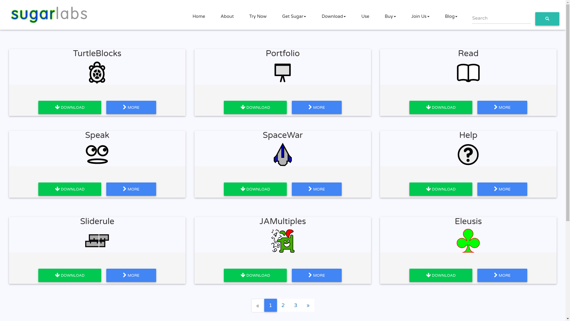
Initial UI
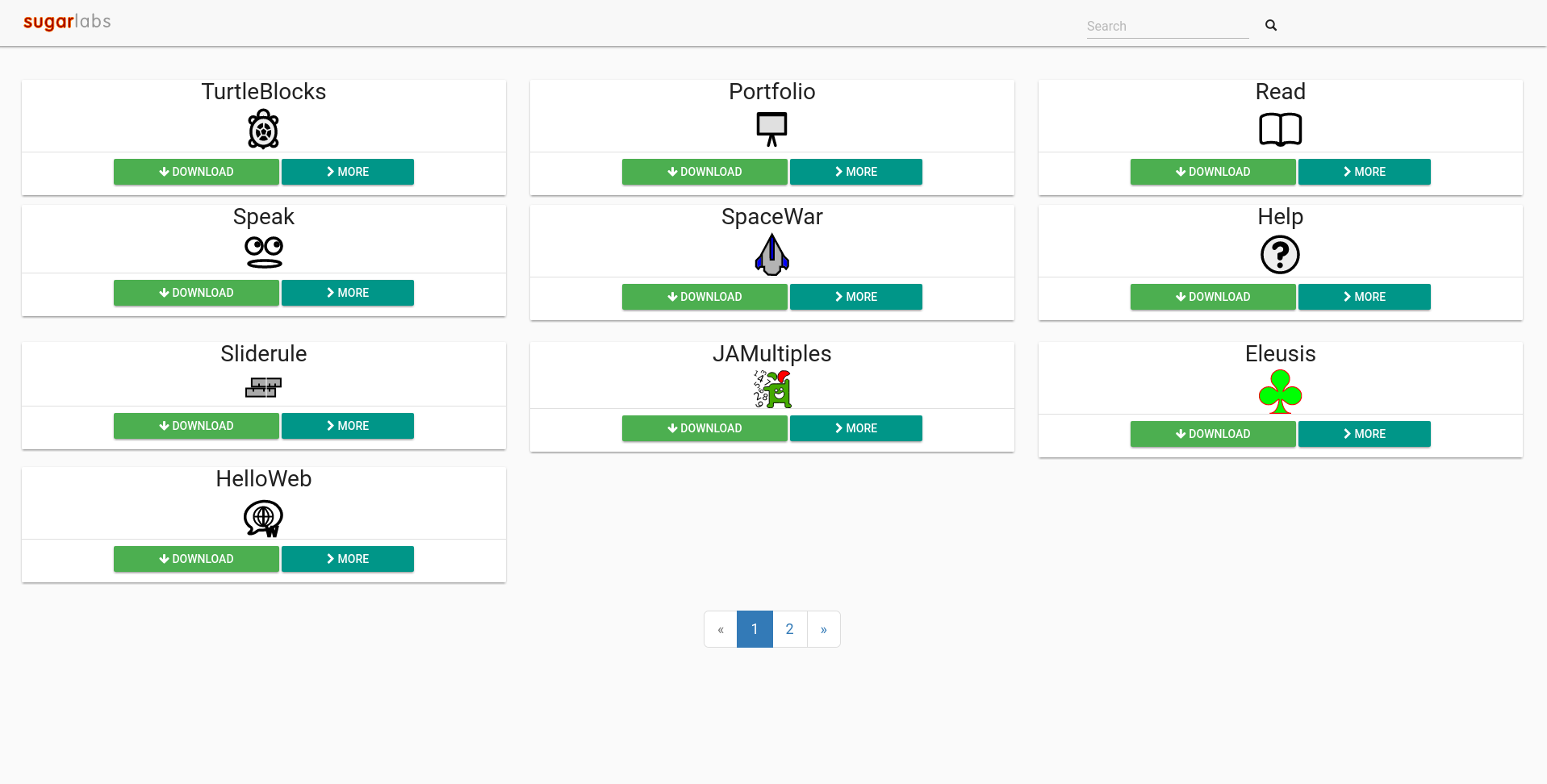
New UI
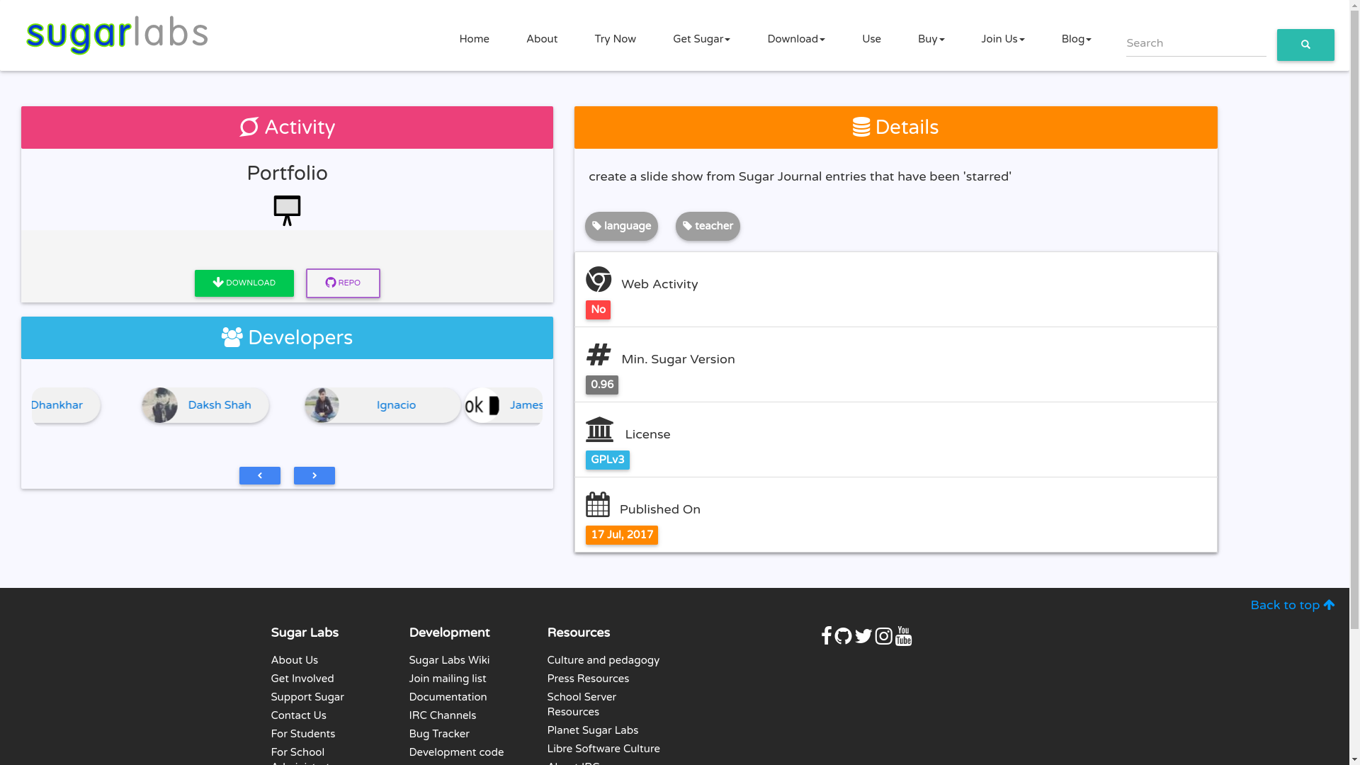
Old Aslo Detail Page
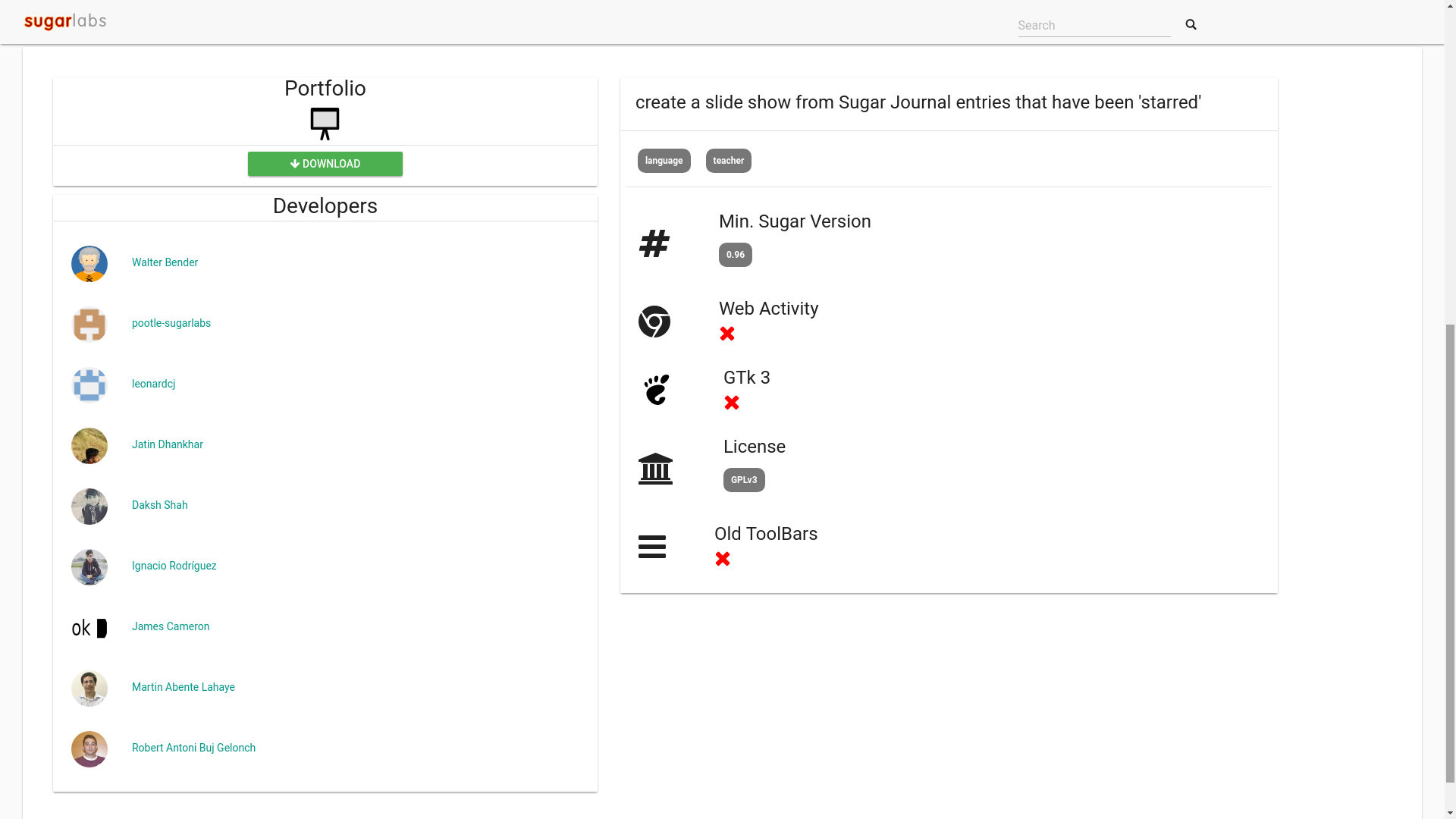
New Aslo Detail Page
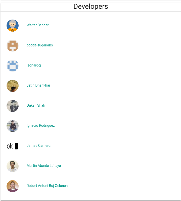
One thing was worked on the was developers section. Earlier we used to show Developers in a vertical list, which extended the page length in some cases.
Old Developer List
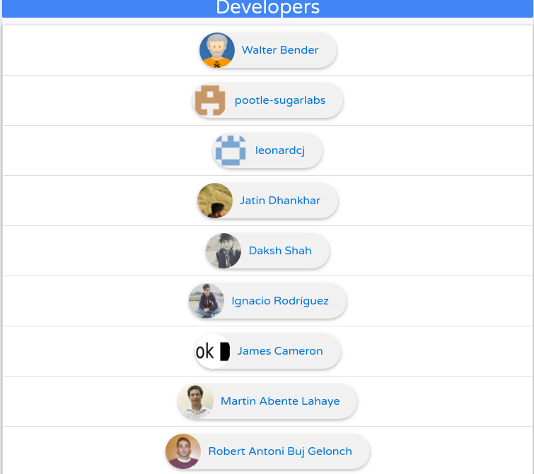
Then I thought of replacing the developer card with pills.
Old Developer Pill List
Later list was removed and developer pills were placed inside sections.
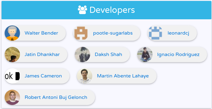
Big Picture with Pills
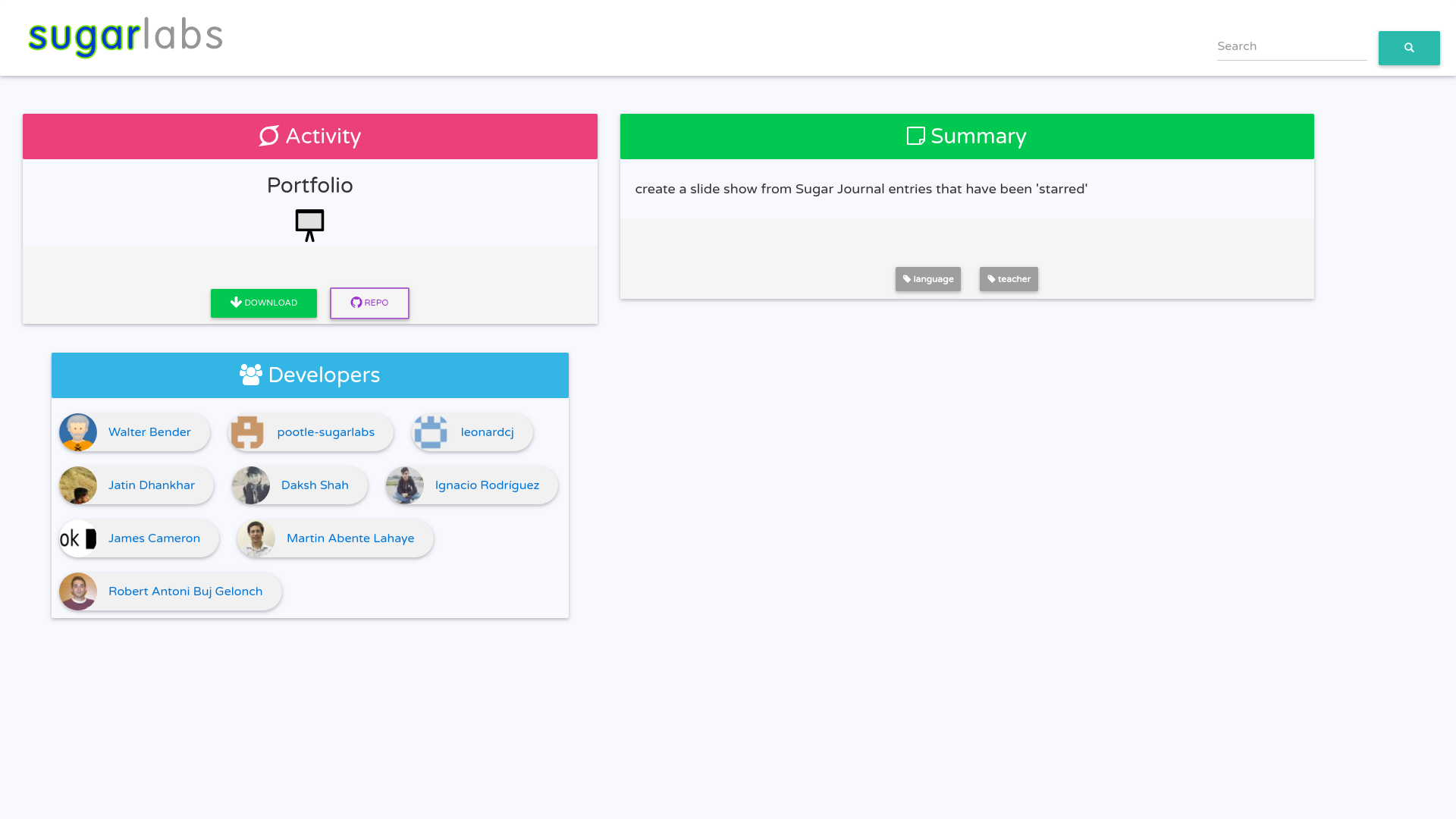
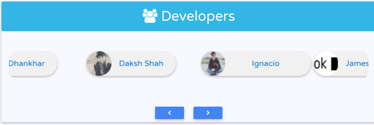
which was finally replaced by horizontal scroll list/carousel with pill as items. Implementation was inspired by https://bootsnipp.com/snippets/featured/carousel-product-cart-slider.
Developer Carousel
Developer section was not working on small screens so now it gets hidden on small (sm) and extra small screens (xs) so as to ensure smooth UX.
Categories were made to look like tags.
Goals for Next Week
Now that UI is almost in place. This week I intend to focus on testing and documentation. Can’t wait to release a fully fledged version of aslo-v3 ( which will be happening very soon ) If you find any typos,mistakes or any other inconsistencies, let me know and I’ll fix them.
Comments